I had a moan about XCOM 1 being prettier than XCOM 2 the other day and got some nice replies from the Art Director of both, Greg Foertsch.
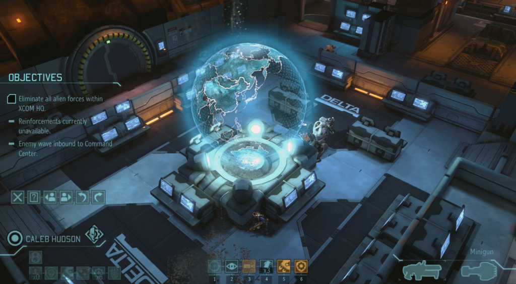
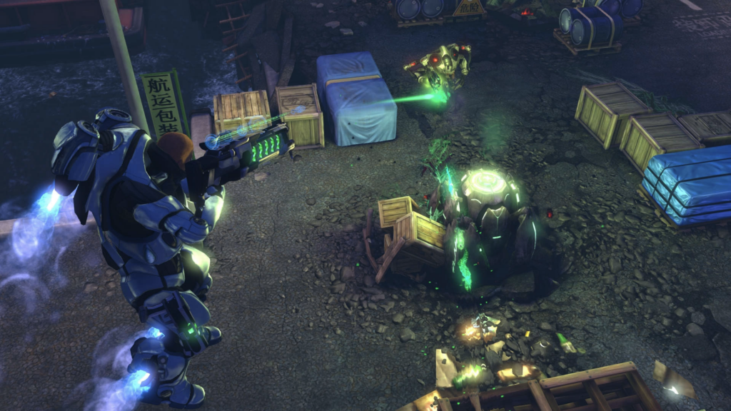
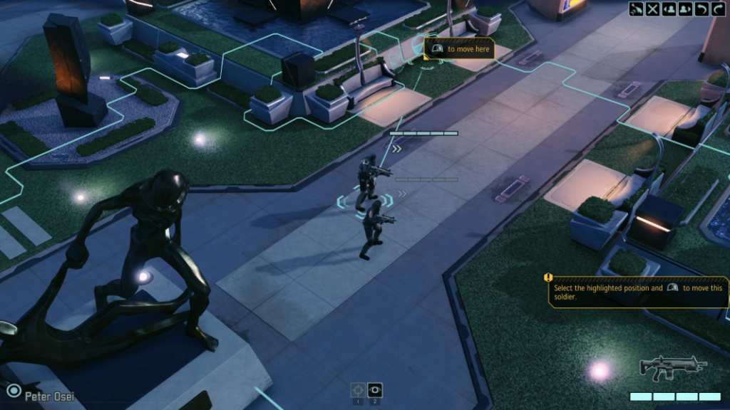
Having replayed both again just lately, it’s striking to me how much more interesting 1 is visually. It uses baked lighting (Unreal’s Lightmass, first seen in Gears 2) and gets lovely results; 2 doesn’t, and gets no indirect lighting.
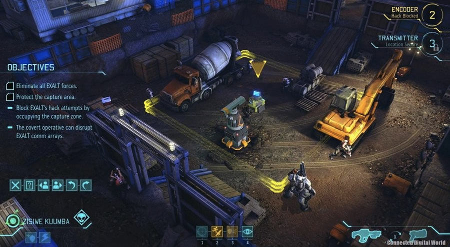
XCOM 2 also has less of the nice cartoony style of 1, going for something closer to generically modern – lots of clean shiny surfaces with screenspace reflections (not part of UE3, so done custom for XCOM 2 or backported from UE4), very flat, very sparse. The best-looking areas (forests, etc) break the visual up with too much noise, which feels like an occasional bandaid on the lack of global illumination, which gives some amount of “free” variation to the scene on top of just being very pleasant.
My assumption is that 2 ditched static lighting in favour of more semi-procgen level assembly and swappable time of day and stuff, which you can still statically light, but with a lot of extra hassle. Personally, it’s hard for me to see it as worth it without any other GI subbing in.
As I said on Twitter, though, I’ll probably be in the minority in caring what this type of game looks like at all. Which is where Greg came in:
Greg Foertsch:
I appreciate that minority. The baked lighting in XCOM:EU served it well and along with a lot of familiar environments, really resonated with players. Your assessment of the games is correct. The design problems in X2 we were trying to tackle dictated some of the decisions that were made. XCOM:EU will always be my favorite of the two. Lots of good insights in your comments. I could talk about this stuff all day
And in response to someone else, about the dynamic lighting:
Correct. The addition of procedural levels and dynamic lighting together had a significant impact on my approach to the art direction
Greg seems cool, thanks Greg
in reply to @joewintergreen’s post:
i was thinking on monday about how i want to do a little bit of procgen levels for my project, but also use static lighting, and the thought did not occur to me that the two might be incompatible.
but now that i am aware of it, i already have an idea of how i might solve that! (it’s throwing procgen out)
Doesn’t 2 have PBR where 1 doesn’t? I agree and I feel like a lot of games with established technology switching to early PBR stacks tend to look worse in a lot of ways if only on the basis of their texture work (such as fallout 4 vs fallout 3). Something about procedural textures not comparing to photo sources ones, looking kinda bad without GI. Kinda like early color video looking like ass but not as extreme.
I think they’re over coming the hump now with good GI. Nobody talks about this so I’m not sure if it’s just me.
2 is PBR, but I don’t think it’s really a factor – neither used photosourced textures (and those are still a thing in PBR). No baked lighting in 2 is a huge factor for sure because they had nothing really to replace it with, but it’s also enormously the less-but-still-a-bit cartoony style imo. To me it is just Worse
But yeah, dynamic GI is actually good now as of Lumen and there’s a bunch of also-good less general approaches on other engines. It’s amazing as a developer to be able to get baked-quality lighting in realtime finally
Leave a Reply